4Doves First Aid

Brand Design · Web Design · Social Media · Print

4 Doves First Aid Training is a HSE-compliant first aid training business, offering workplace courses, childcare first aid, mental health first aid, and specialised/outdoor courses. The name is a personal one: “4” represents Sue’s four daughters, paired with “Doves” from her surname, so the identity carries real family meaning alongside the first aid symbolism. The brand was built around three pillars: authority, reassurance and approachability.

Logo

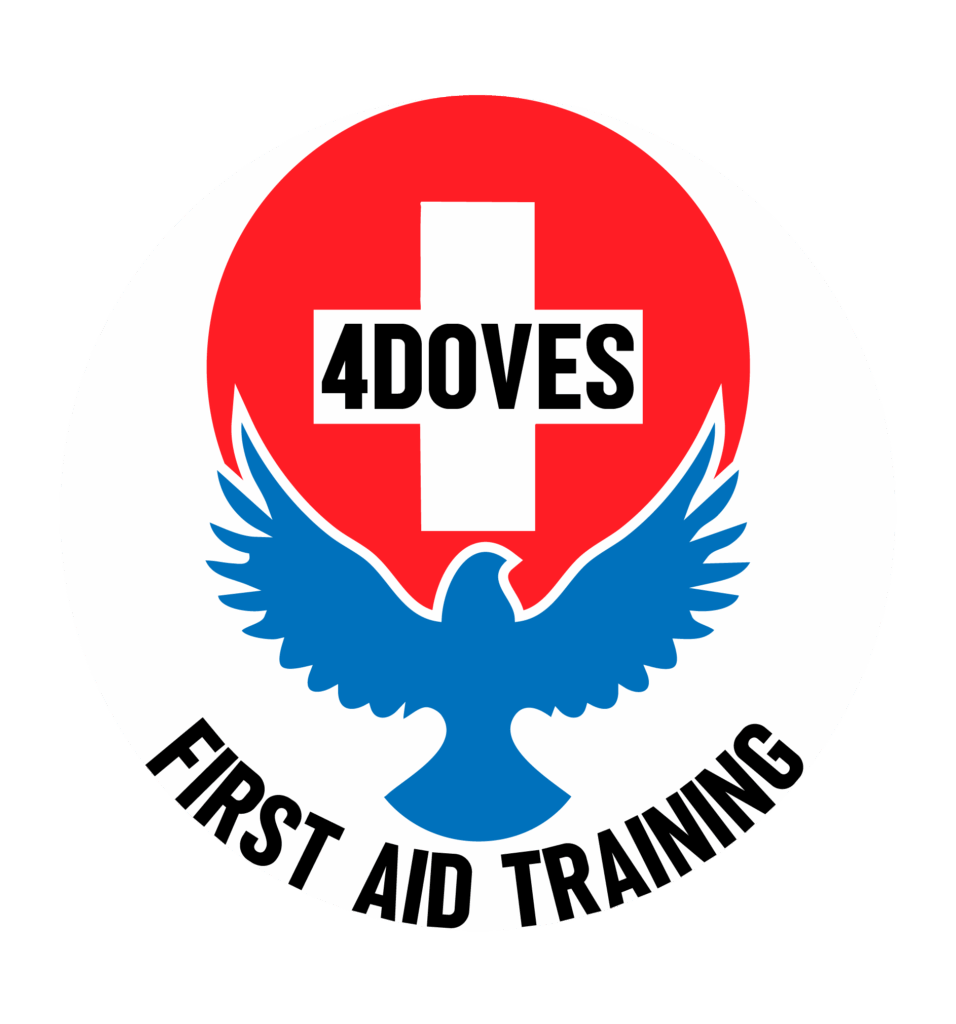
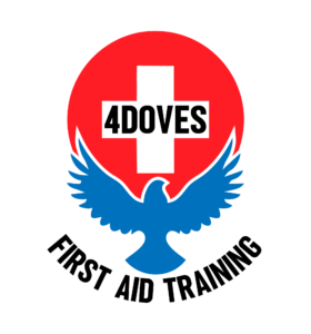
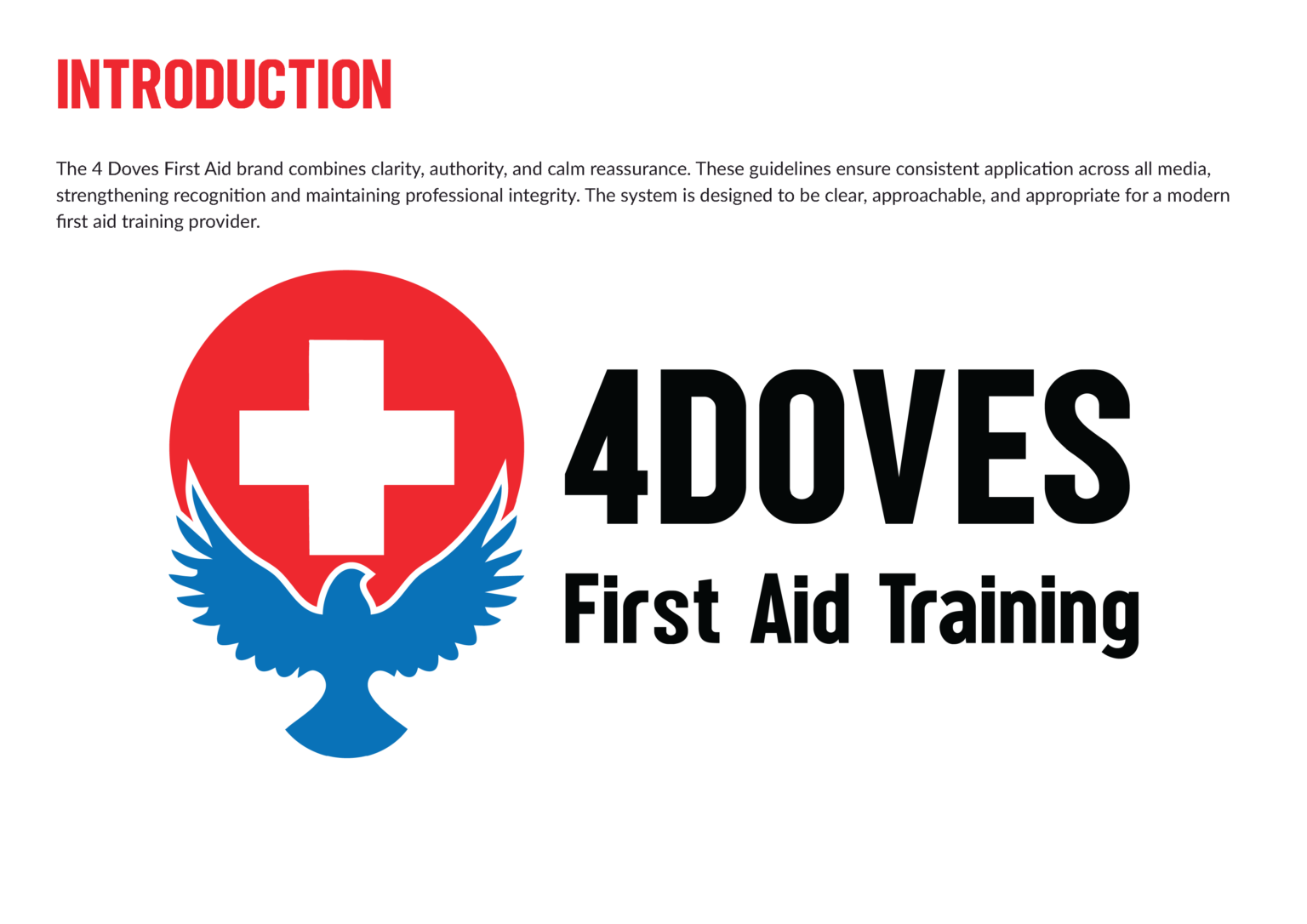
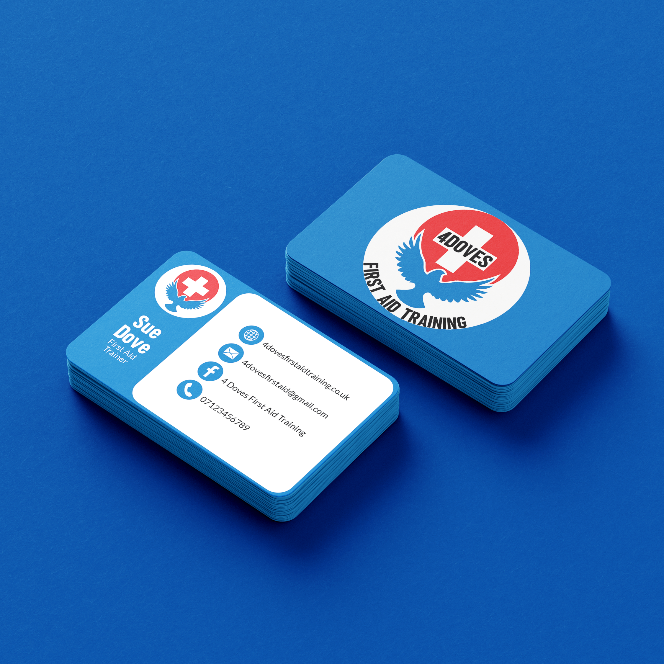
4 Doves First Aid Training Logo designed by BzCreative

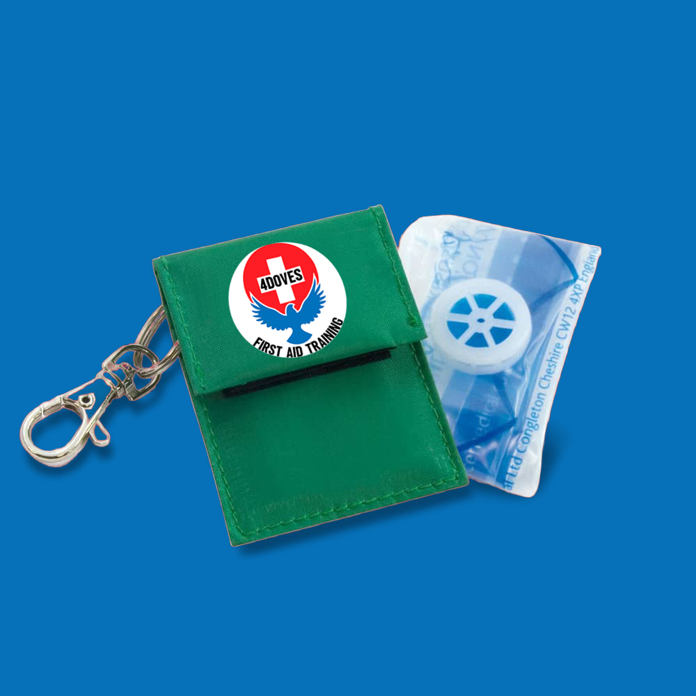
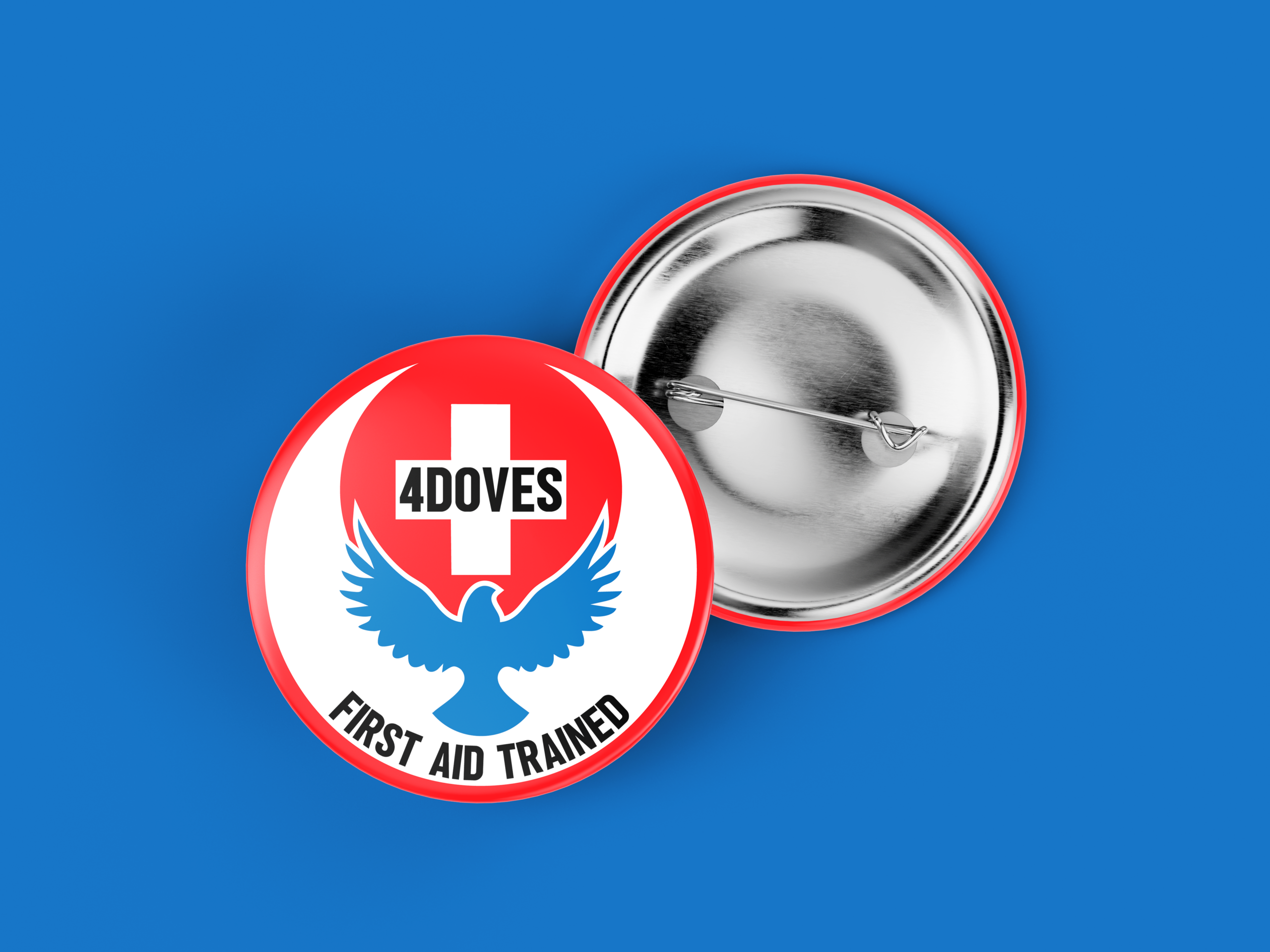
The core challenge was making a family name feel credible as a professional medical brand without losing its warmth. The medical cross gives instant, unambiguous recognition, but a cross alone is generic and clinical, so the dove was layered underneath it, rising out of the cross itself, to fuse “help” with “peace” and soften the clinical edge into something more human and caring.

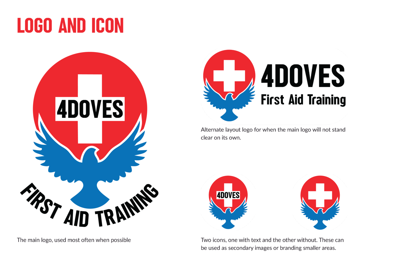
Putting “4DOVES” directly inside the cross, rather than as a separate wordmark, means the name and the symbol are read as one unit, so the personal story sits at the literal centre of the mark rather than being tacked on.

The arced “FIRST AID TRAINING” wrapping the base does double duty: it locks the descriptor into the badge shape so the mark still reads clearly as a first aid brand at a glance, while keeping the circular badge form which suits certification-style contexts (course completion, accreditation, professional trust).


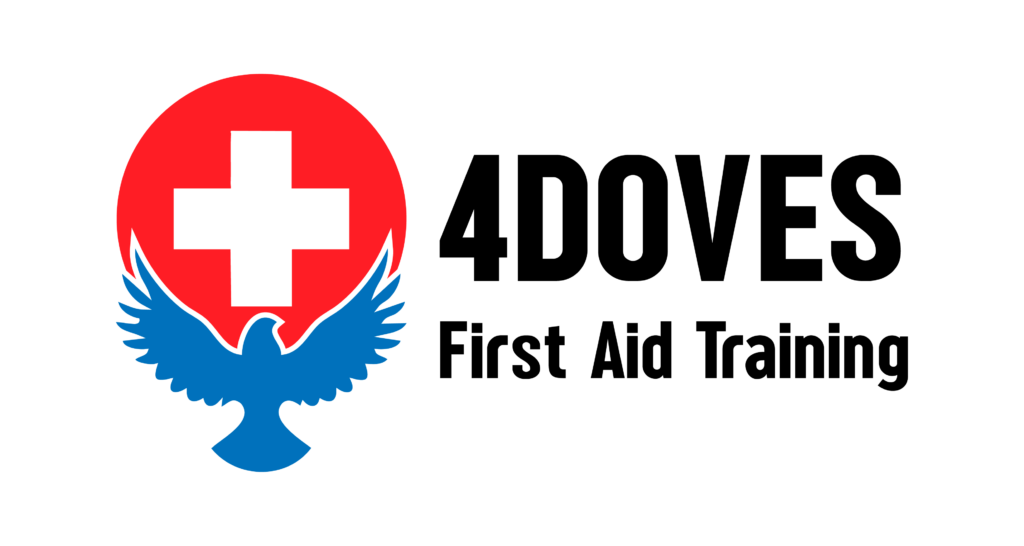
The icon-only and horizontal lockups exist so the mark still works small (embroidered patches, social avatars) without losing legibility, which a badge-style logo can struggle with if it’s only designed at one scale.

Website

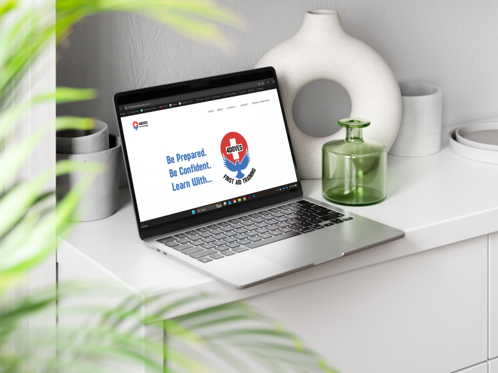
Sue was already on GoDaddy Website Builder and wanted to stay there so she could update the news section herself, so the site had to work within a template CMS rather than a custom build.

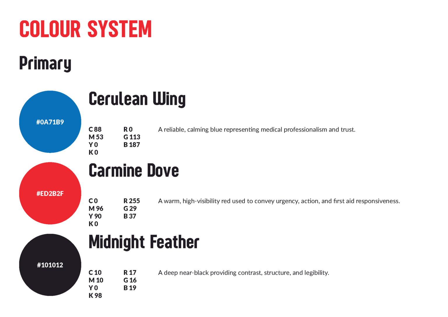
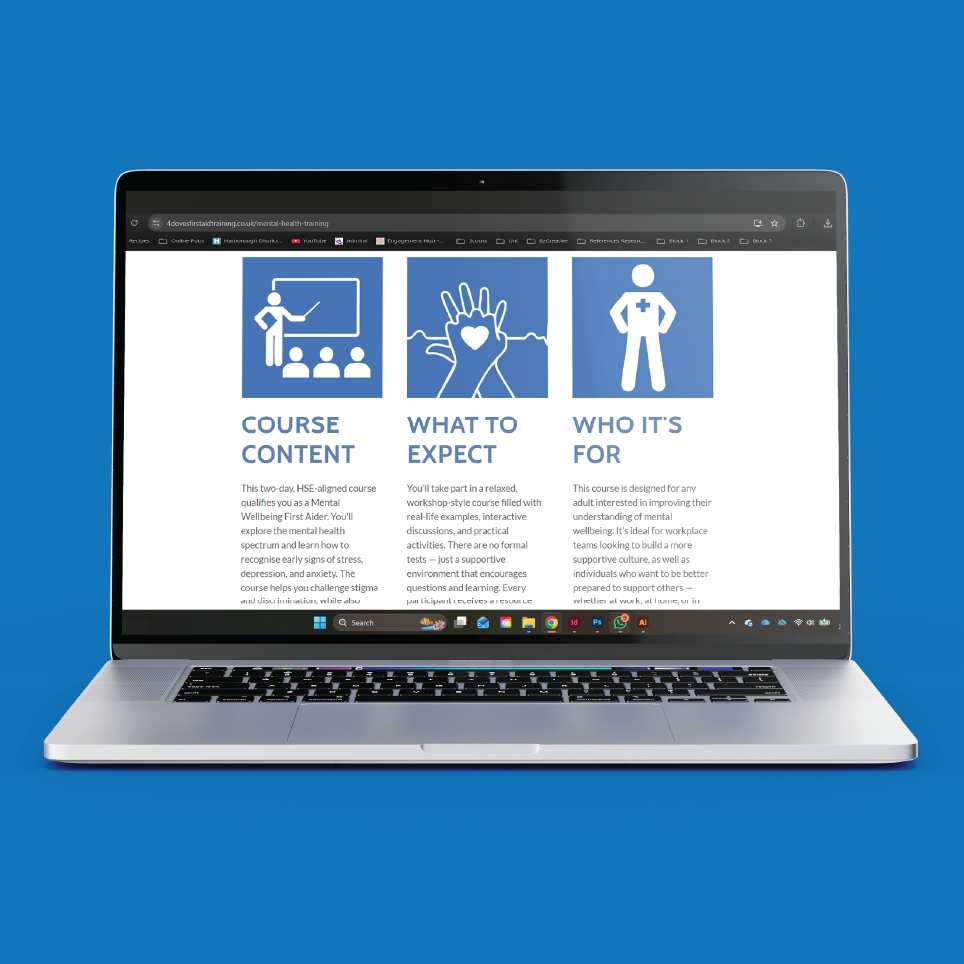
Blue leads as the dominant colour across the site, with red held back purely as an accent for dates and calls to action, keeping the tone calm while red stays sharp where it’s needed.

Navigation is kept short and decluttered, a slim nav bar with one dropdown for courses. Clicking a course takes visitors straight to that page rather than a generic hub, keeping the path from ad to booking as short as possible.

Campaign Material

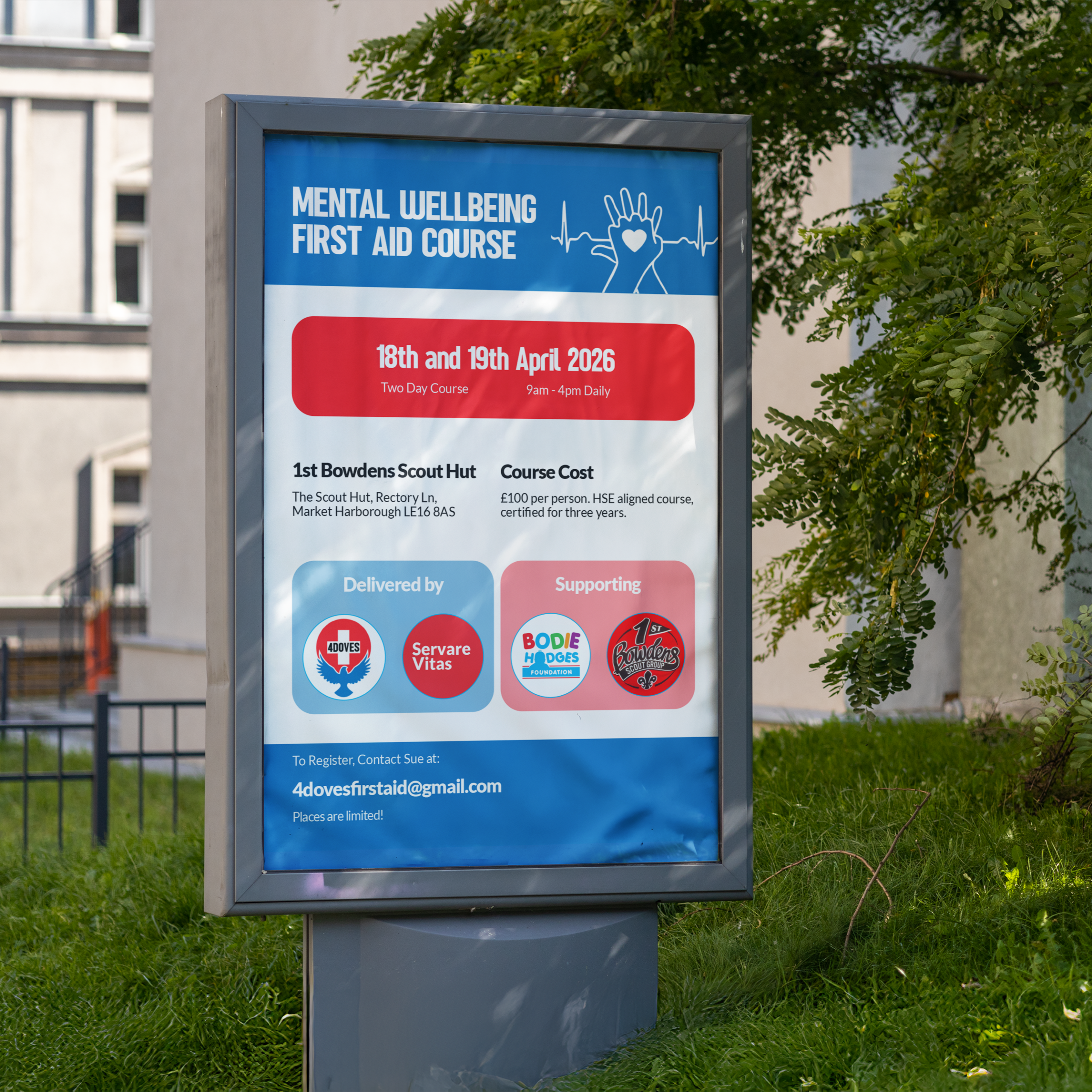
The Mental Wellbeing First Aid Course poster and social assets support a two-day course run in partnership with Servare Vitas, in aid of the Bodie Hodges Foundation and 1st Bowdens Scout Group. The bold blue banner and red date panel keep the campaign instantly tied to the core brand, while the “Delivered by” and “Supporting” badges give the partnership and cause clear, equal billing without cluttering the layout.


The design stays simple and bold rather than heavy or clinical, since mental health can be a sensitive subject and the aim was to invite people in, not scare them off. That made it well suited to community noticeboard placements, like village boards, where a poster needs to read clearly at a glance and feel approachable rather than alarming.


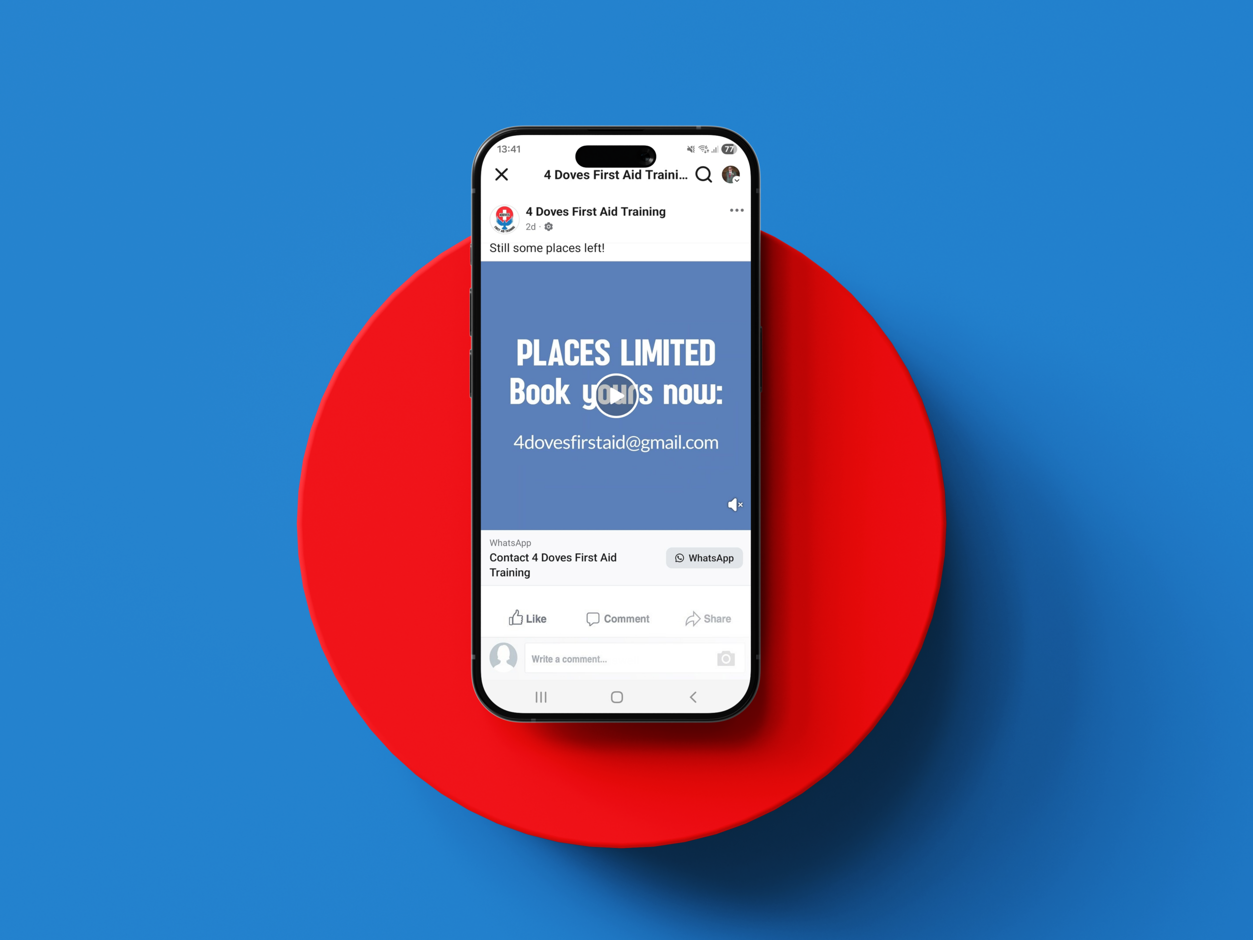
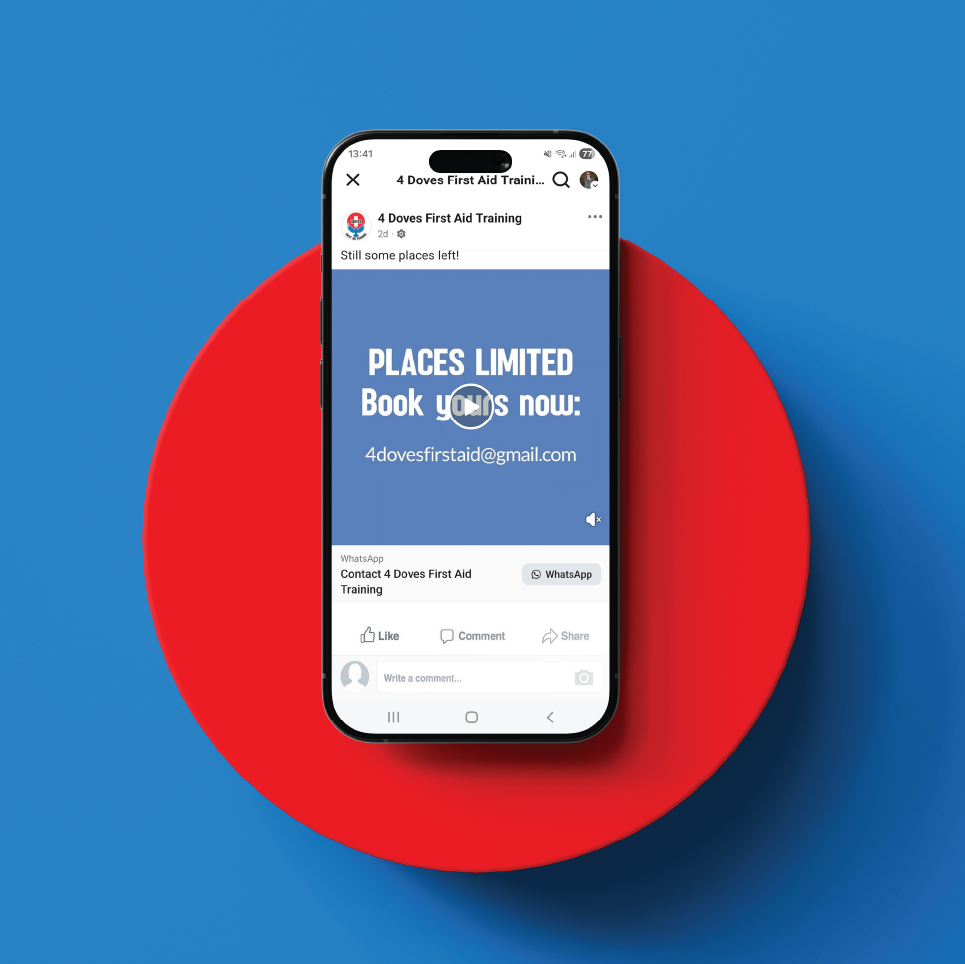
Formats were built across a poster, Facebook post, and square Instagram tile from a single layout, so the same visual language holds whether it’s seen on a noticeboard or scrolled past on a phone.

Brand Toolbox

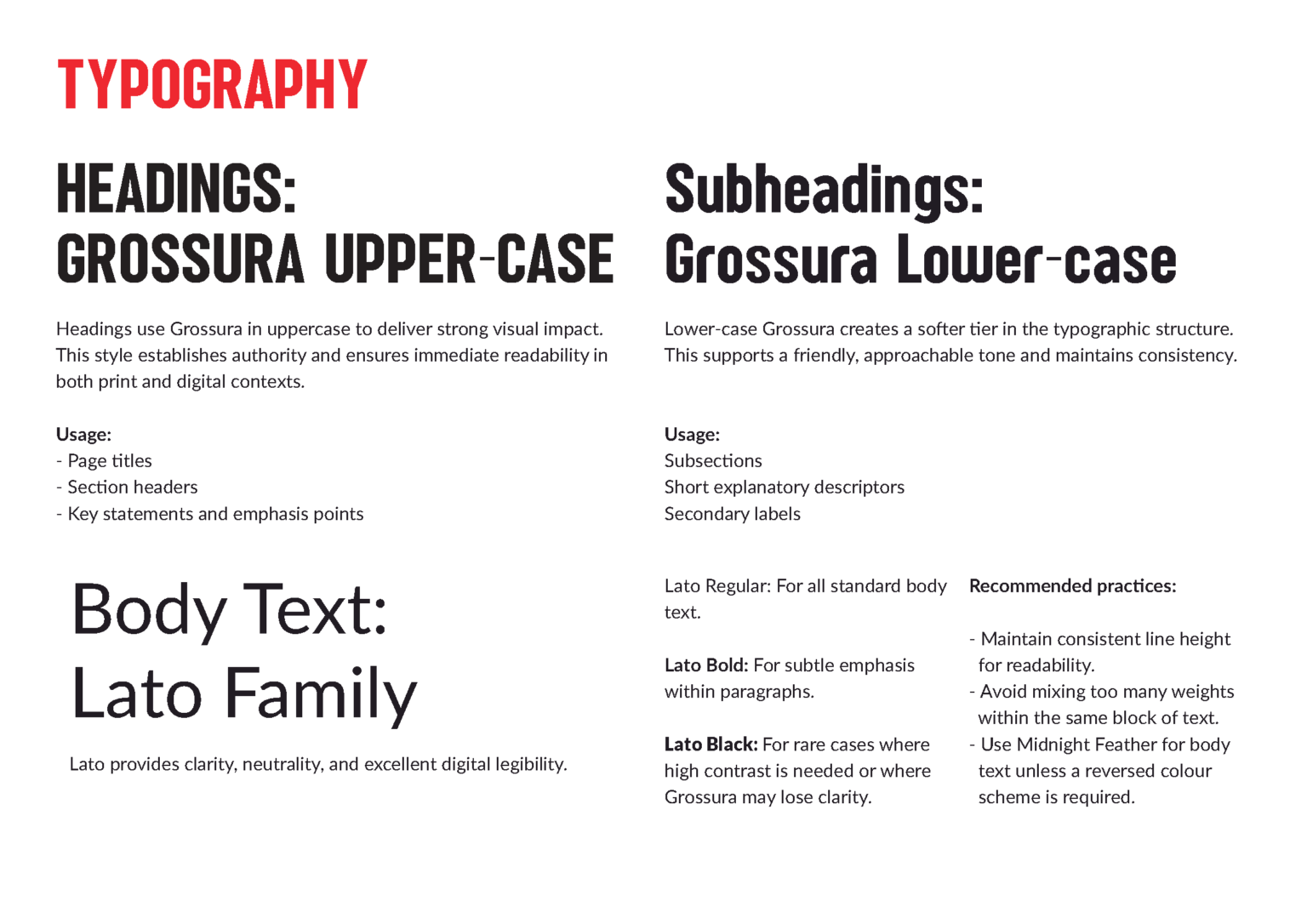
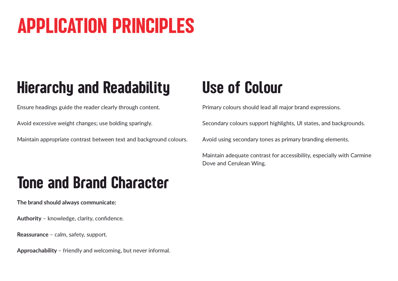
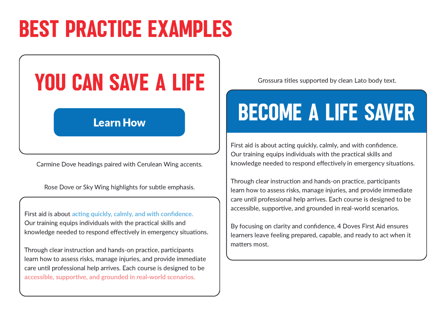
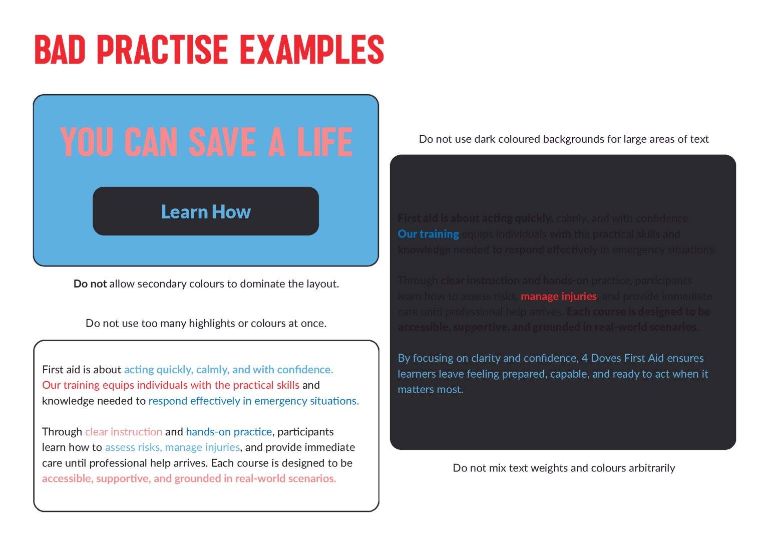
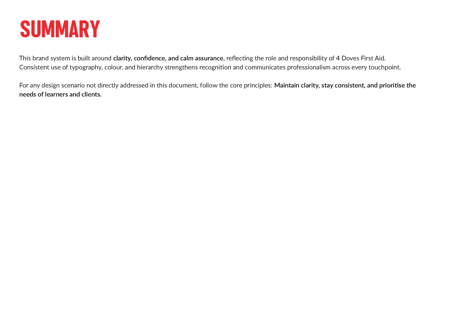
The full toolkit covers colour, typography, hierarchy and do/don’t examples, so the brand holds up consistently across everything Sue produces herself, even without a designer on hand.

Brand in Action

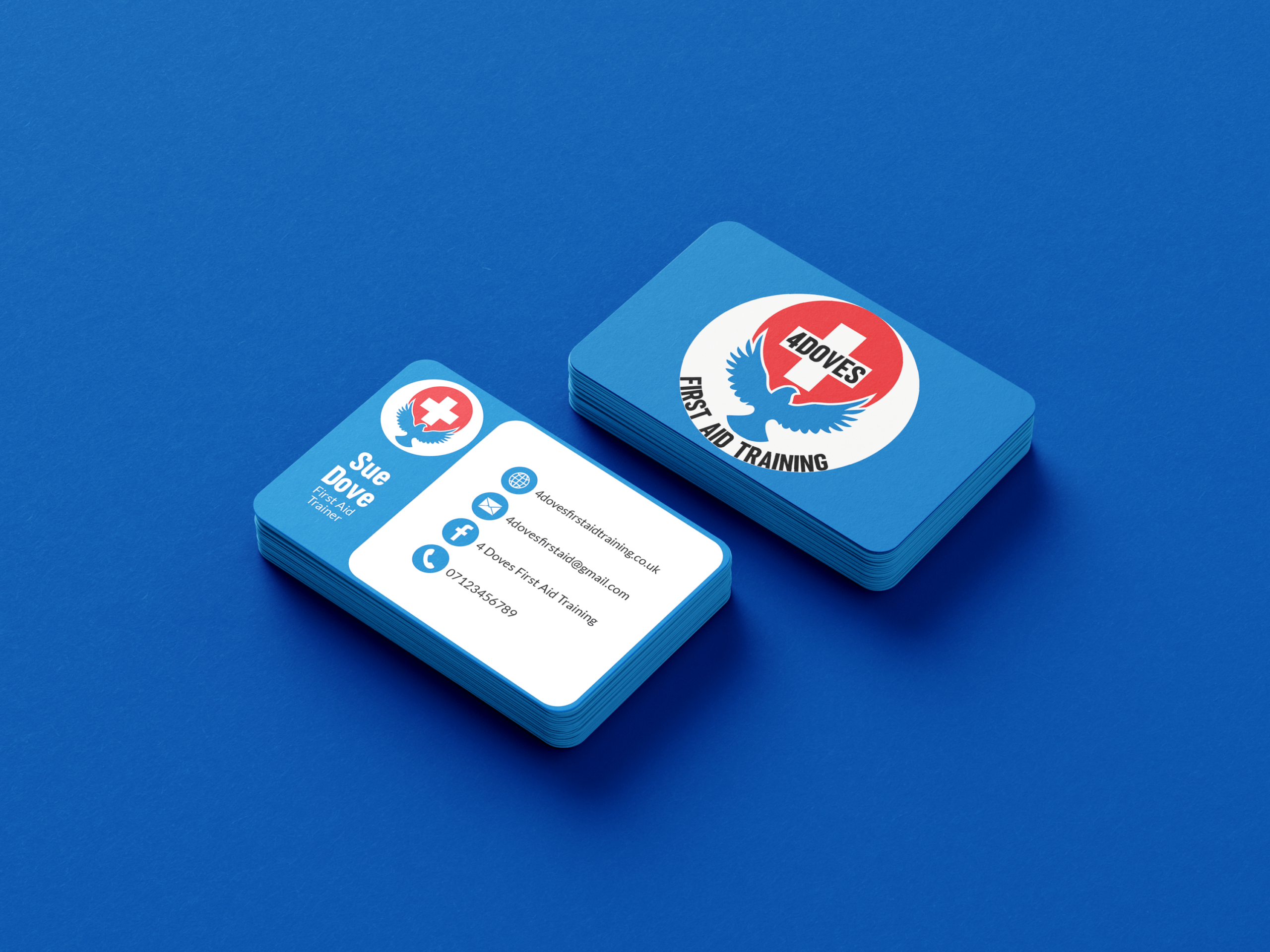
Urgency and calm in the same mark: red for the moment that needs you, blue for the steady hand that helps.