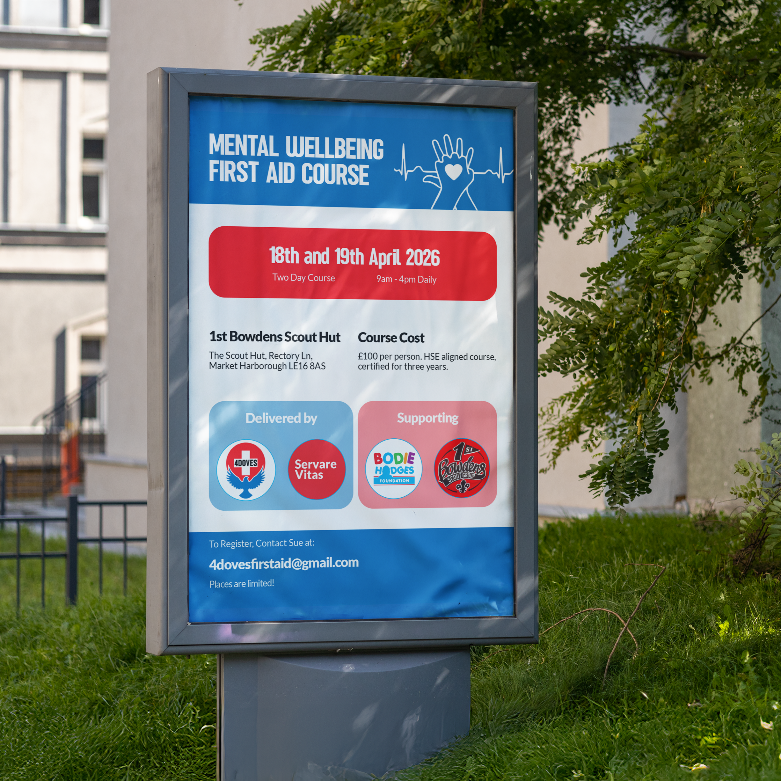
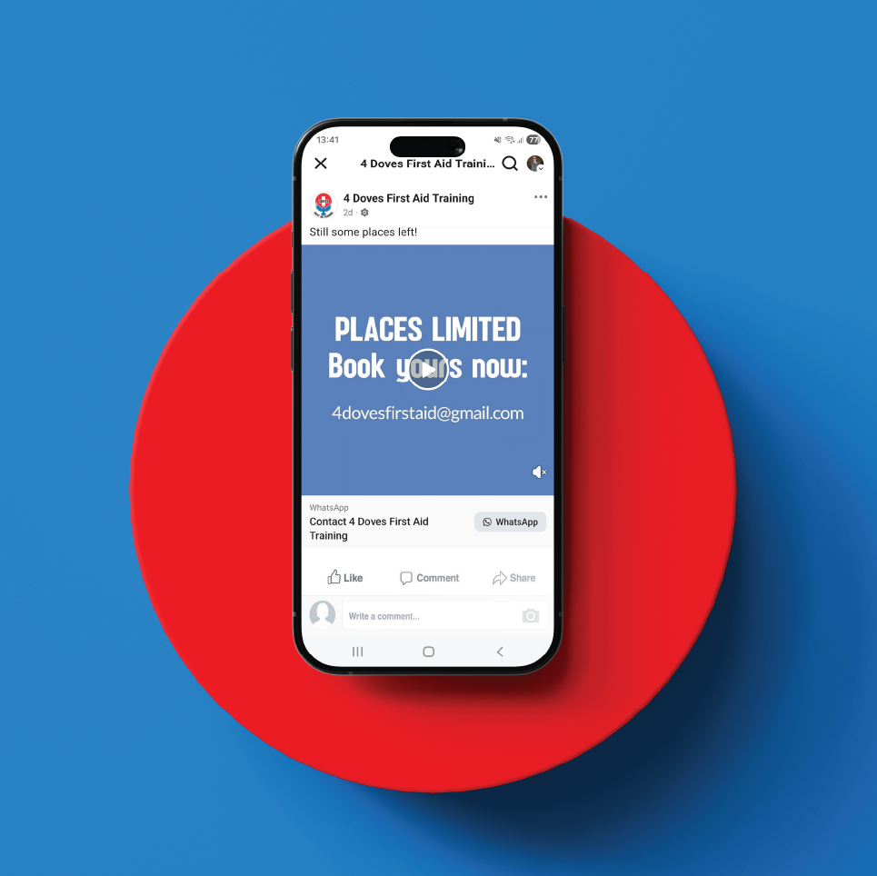
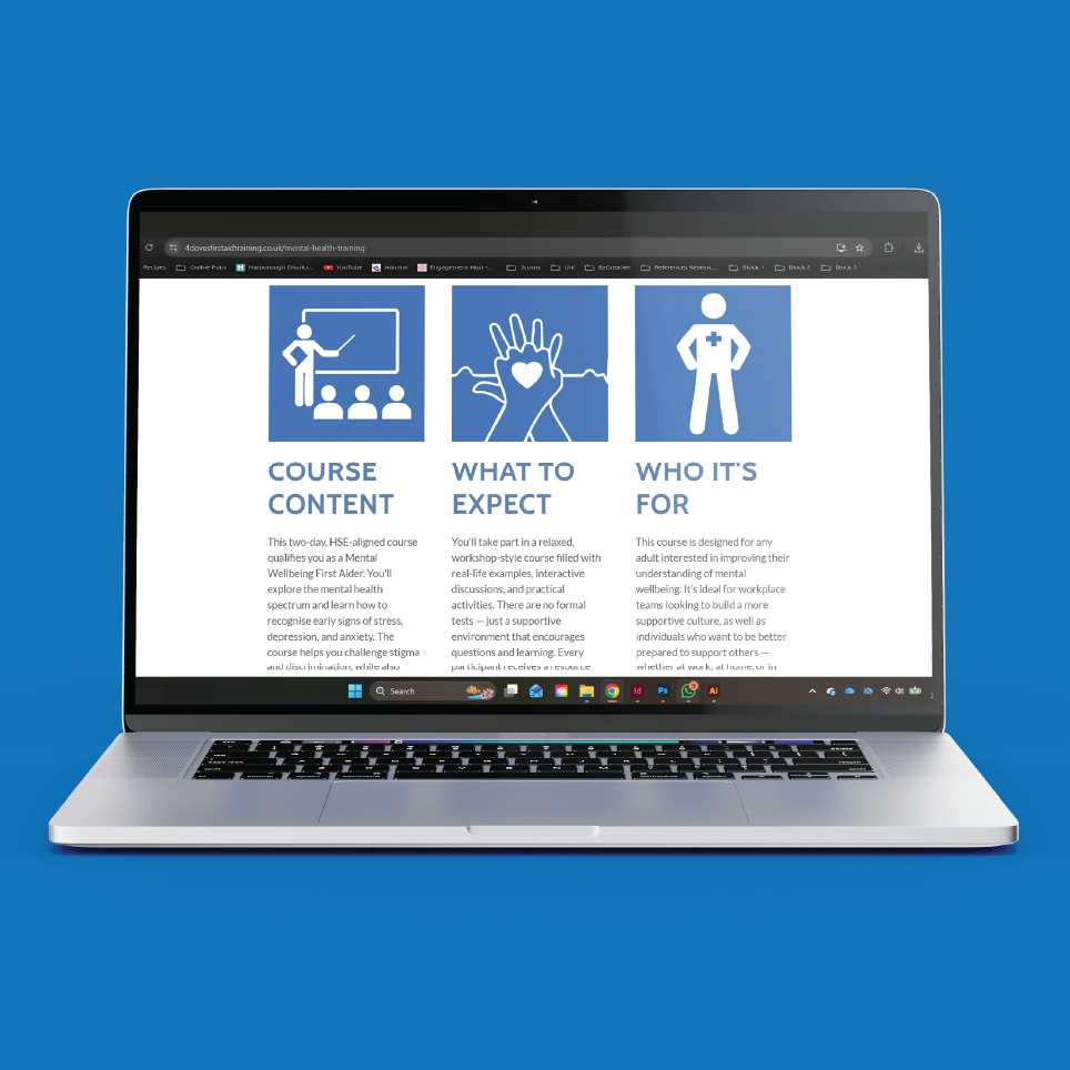
The Mental Wellbeing First Aid Course poster and social assets support a two-day course run in partnership with Servare Vitas, in aid of the Bodie Hodges Foundation and 1st Bowdens Scout Group. The bold blue banner and red date panel keep the campaign instantly tied to the core brand, while the “Delivered by” and “Supporting” badges give the partnership and cause clear, equal billing without cluttering the layout.
The design stays simple and bold rather than heavy or clinical, since mental health can be a sensitive subject and the aim was to invite people in, not scare them off. That made it well suited to community noticeboard placements, like village boards, where a poster needs to read clearly at a glance and feel approachable rather than alarming.
Formats were built across a poster, Facebook post, and square Instagram tile from a single layout, so the same visual language holds whether it’s seen on a noticeboard or scrolled past on a phone.